Bindr.AI
Designing an all-in, not all-in-one operations hub that connects SaaS marketplaces and workflows for small business operators.
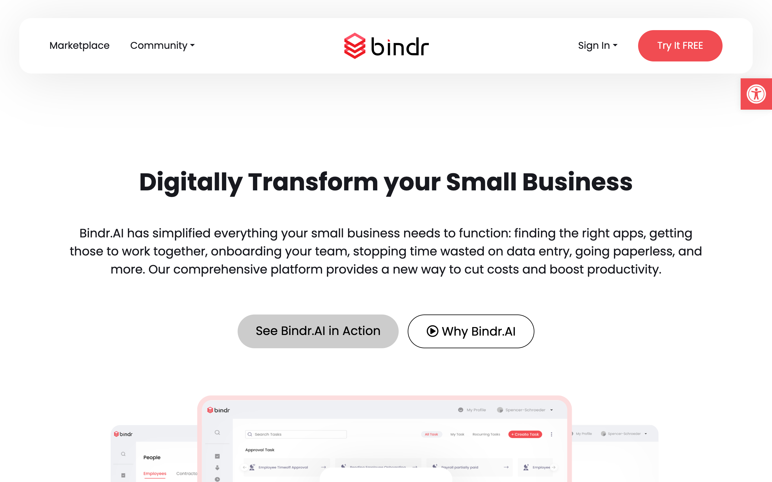
All-in, not all-in-one
Bindr.AI is a small-business operations platform designed to coordinate rather than replace existing applications. The platform acts as a unified marketplace and single sign-on layer, consolidating timesheets, task tracking, employee onboarding, digital forms, health kiosks, expenses, time-off, and payroll into one dashboard.
Our primary users are small business operators in healthcare, construction, warehouses, restaurants, and professional offices who are overwhelmed by managing multiple disconnected software utilities.
Software management fatigue
Small business owners were spending more hours configuring and troubleshooting their software tools than running their operations. Fragile custom integrations, manual re-entry of employee profiles, and lack of central access created administrative backlogs.
"We spent hours handling trivial administrative logins instead of focusing on team performance."
"Our digital checklists grew, but our tools remained disconnected, draining our team's optimism."
Unifying the flow
We structured the UX strategy around a single sign-on dashboard backed by an app marketplace. By letting businesses start with one simple utility (like timesheets) and add custom widgets (like HR onboarding) when ready, we removed the hurdle of major system updates.
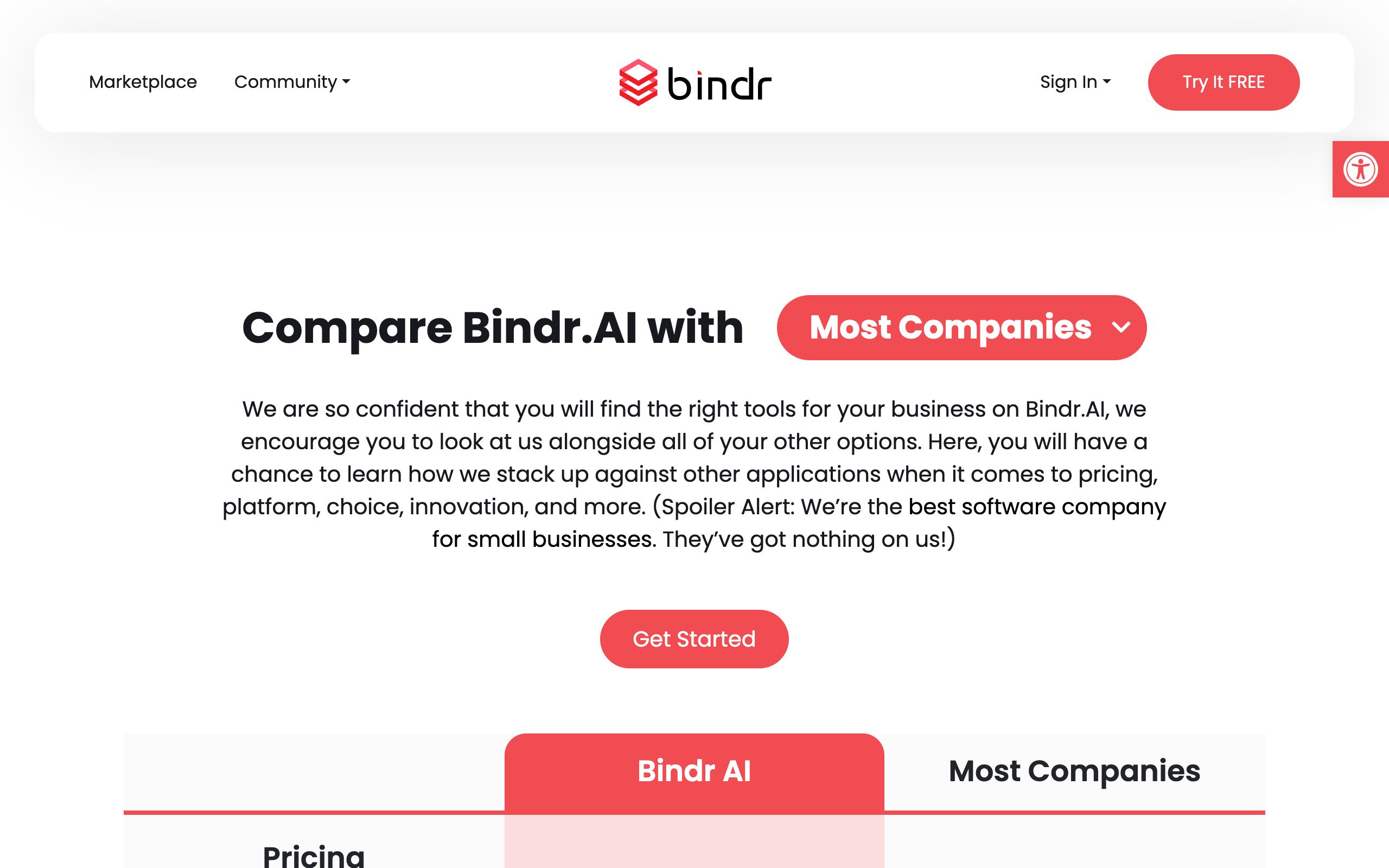
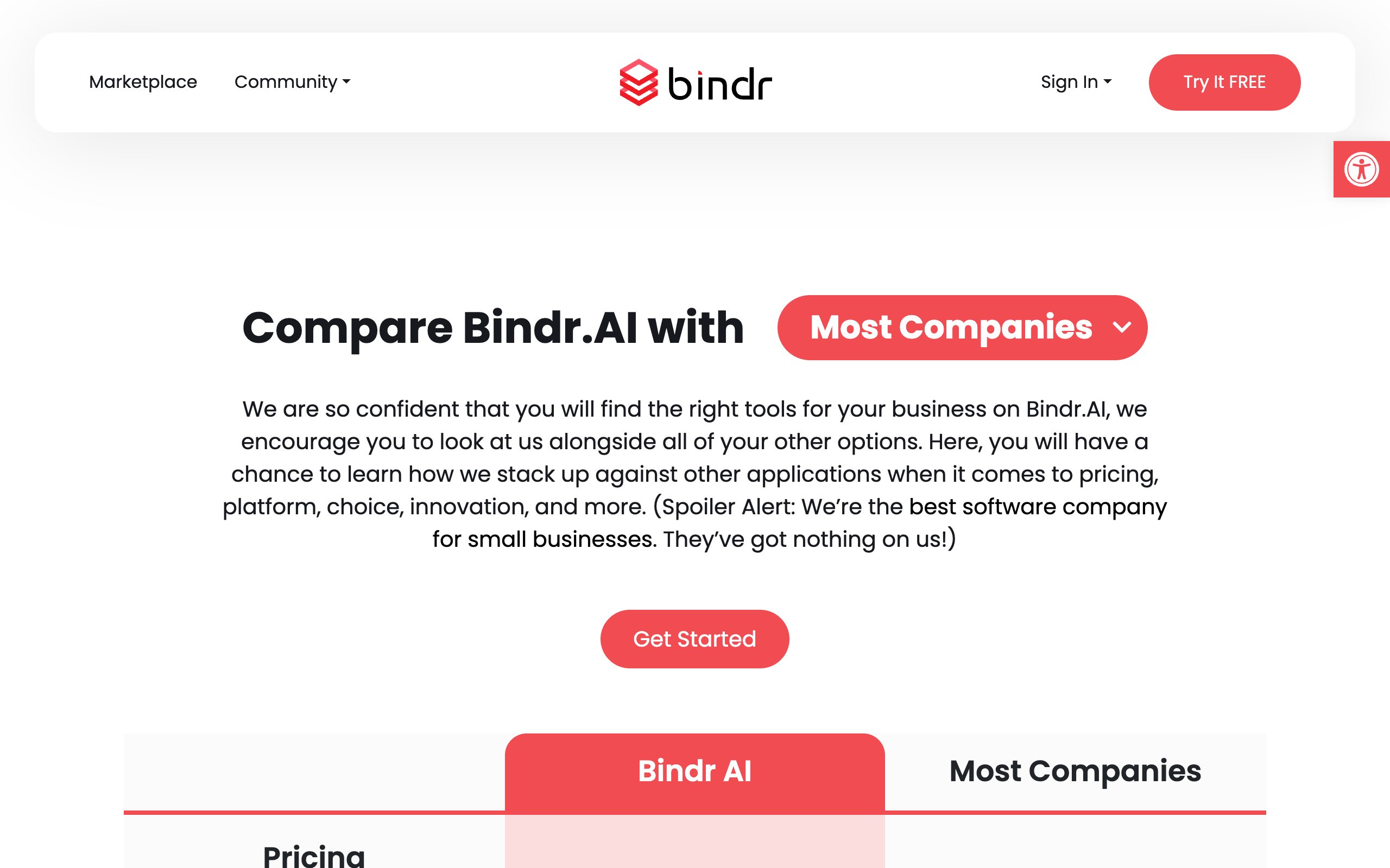
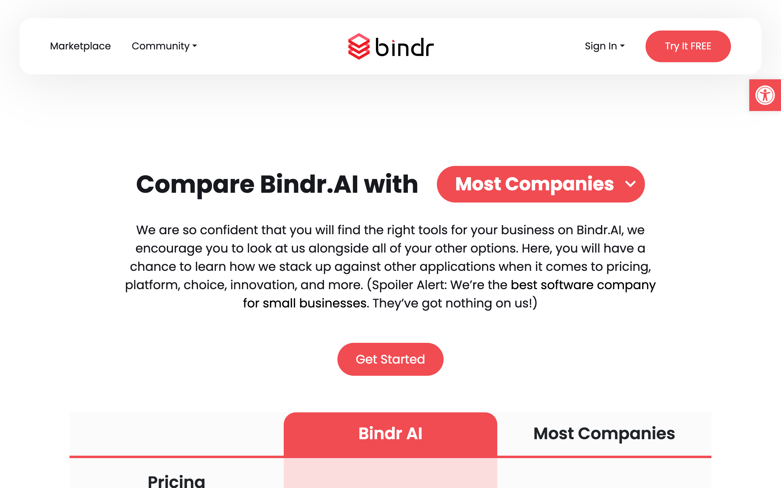
To communicate this transformation on the landing page, we mapped a direct before-and-after interactive comparison table, illustrating how consolidating fragmented apps clears admin load.
The visual core
Palette Specimen
Typography & Buttons
Typography utilizes Poppins, emphasizing structured weight scales and loose line heights. Button UI components are strictly pill-shaped (50px borders) to create an editorial SaaS look:
Grid & Illustrations
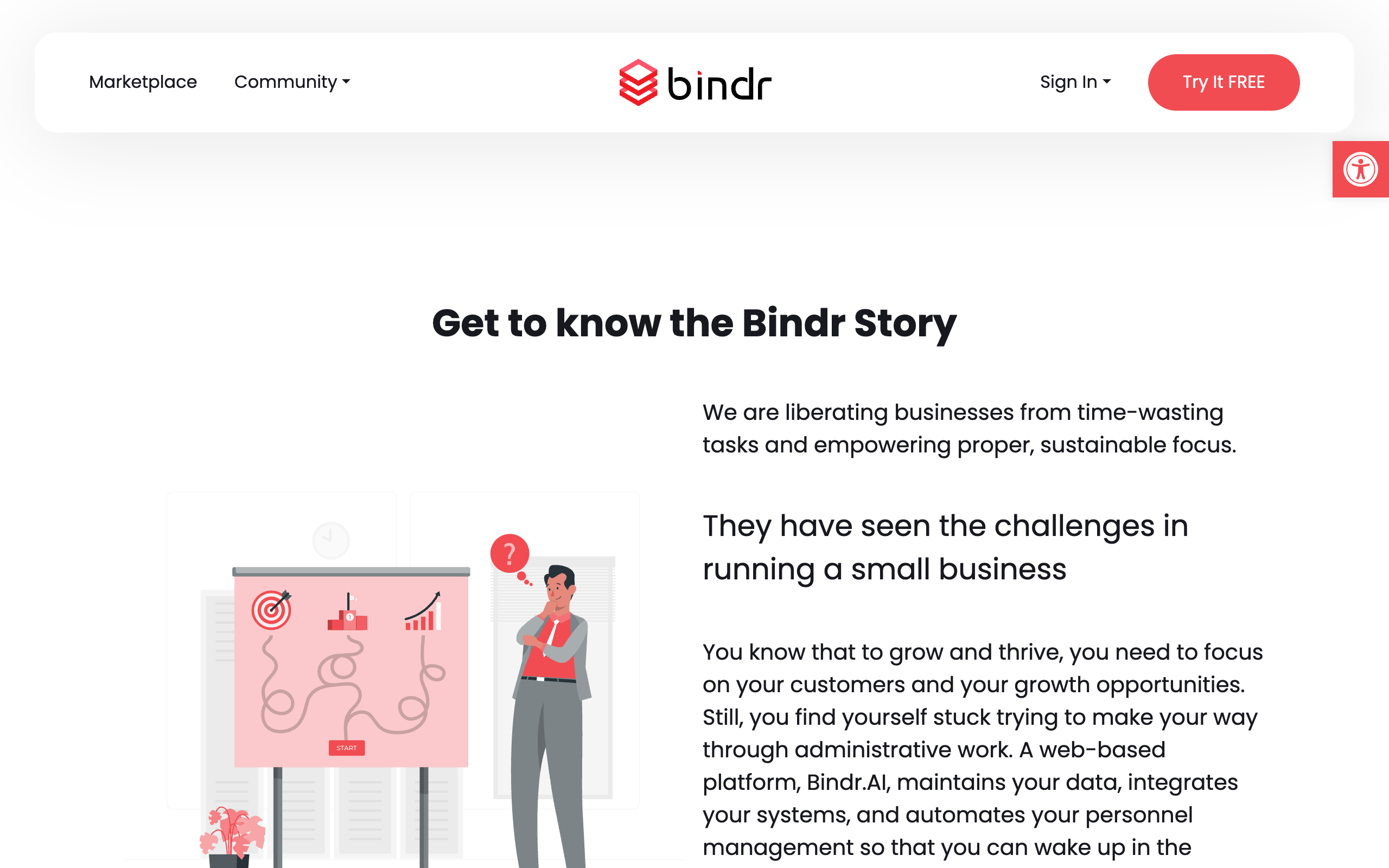
Worksheets and options utilize soft rounded cards with drop shadows. Standard icons sit inside light coral or pink tint chips to anchor scannable grids. The marketing narrative uses flat vector illustrations in the brand palette, contrasted with real screenshots for technical workflows.
Key screens
Workflows & Tasks
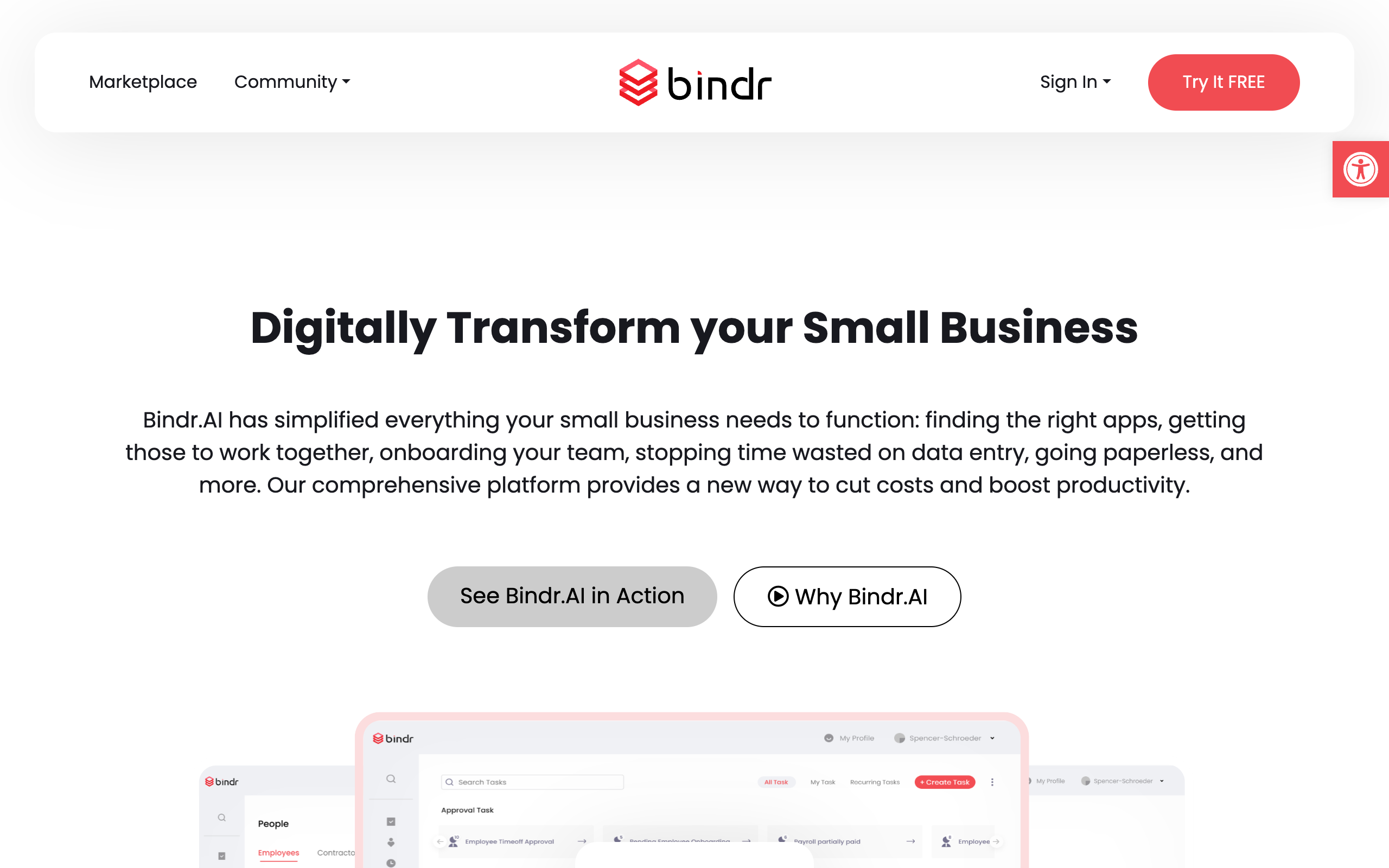
The home dashboard organizes open tasks, pending document approvals, and timesheets into a single feed. Sidebar shortcuts group HR, organizational charts, and payroll tools.
How it works
A step-by-step interactive accordion walks operators through adding team members, setting up direct single sign-ons, selecting marketplace widgets, and assigning delegate duties.
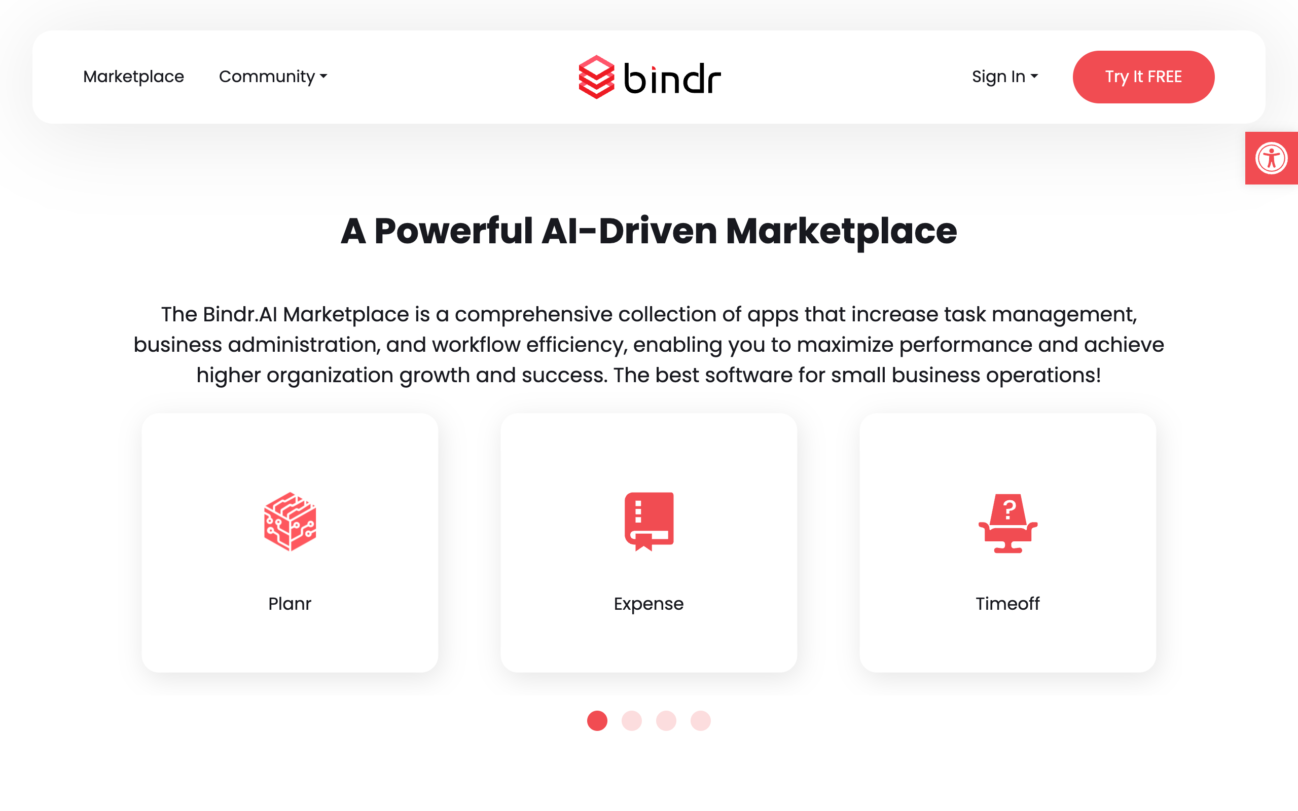
App Marketplace
The application marketplace lists widgets for timesheet tracking, e-signatures, safety checkins, expense logs, and payroll calculations.
Data Security
A dedicated security grid details advanced client data protection, role access authorization, and secure backups, instilling startup confidence.
Goals & OKRs
High-level trackers allow managers to publish team goals and lock sensitive performance reviews behind security scopes.
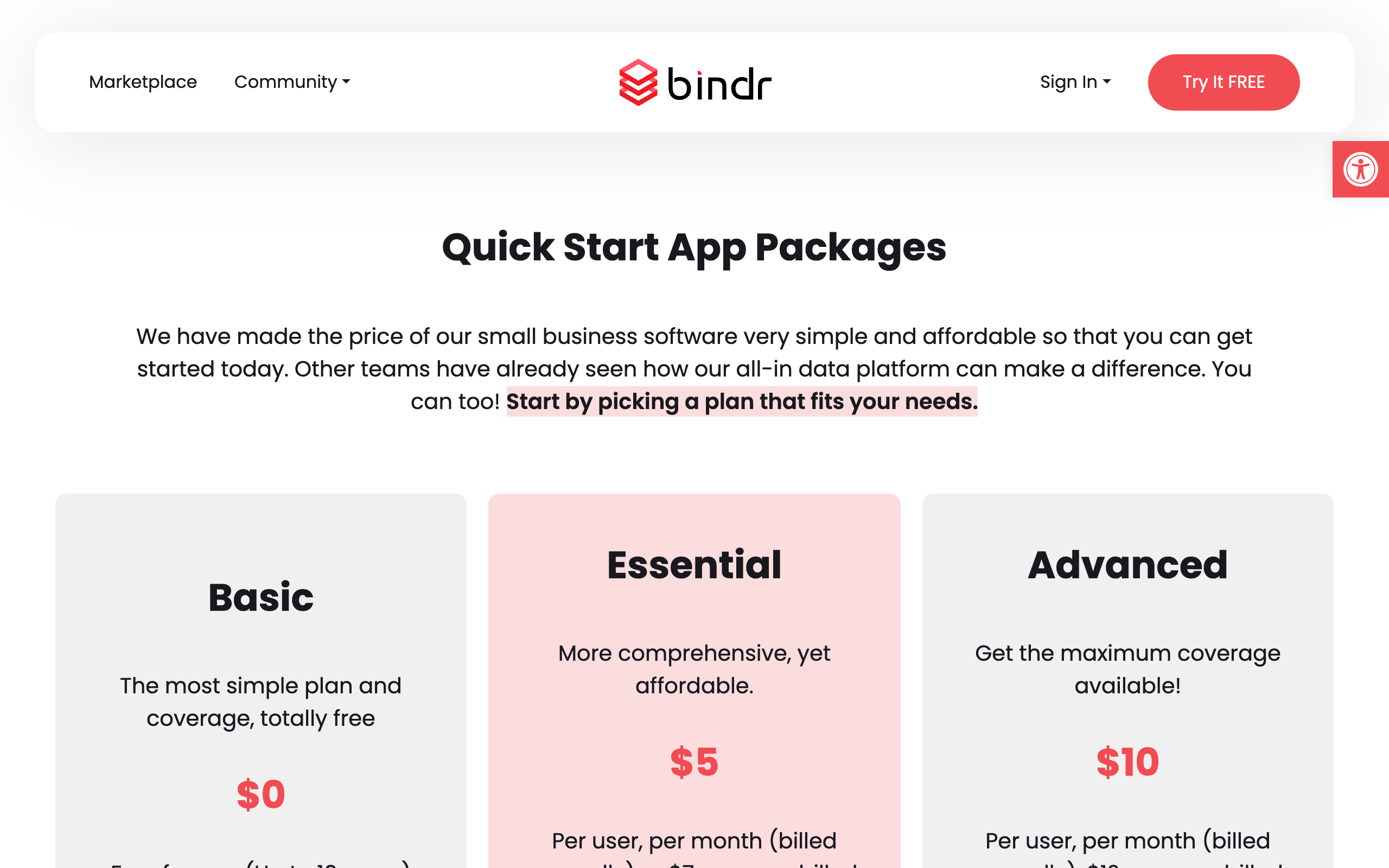
Transparent Pricing
A clean 3-tier matrix outlines pricing options, letting businesses choose between the free tier, core utilities, or customized developer additions.
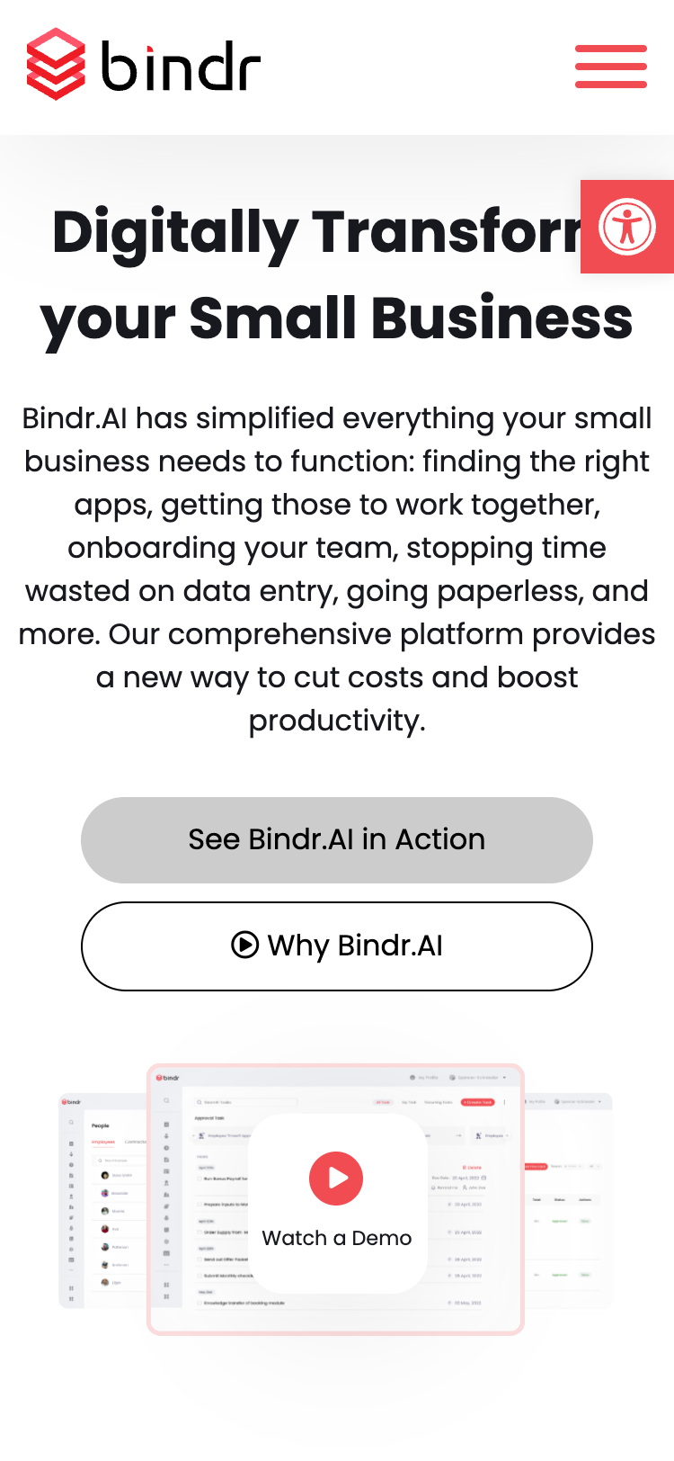
Mobile Experience
Presents responsive screens for on-the-go managers. Timesheet details, onboarding tasks, and company structures align automatically to mobile dimensions.
Outcomes & learnings
The redesign yielded over 10,000 lead conversions in the first month following rollout. By packaging diverse, complex operations into a modular marketplace, we lowered user onboarding friction.
Visual System Autonomy: The unified visual system allowed marketing visuals and application dashboards to share a single styling core. New widgets added by the team never felt bolted on.
Retrospective: If redesigning today, I would increase content density in the core dashboard to reduce scroll depth and streamline the vector illustrations to match the styling of the operational grids.