Enterprise Design System 2026
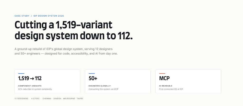
A ground-up rebuild of IDP's global design system. 1,519 component variants reduced to 112, MCP-connected to code, serving 50+ engineers across four cities.
Where this started
IDP Education is a global study-abroad and IELTS examination organization headquartered in Melbourne, with partner universities across the world and offices in Chennai, London, Melbourne, and Taipei. Internally, the product organization is split across three domains: a Partner Portal (the B2B platform our university partners use to manage marketing campaigns, landing pages, and student orders), a Student Portal (the B2C platform for student recruitment), and IELTS (a separately-governed product with its own design system, outside the scope of this work).
I work primarily on the Partner Portal and its sub-products. The design system I built spans Partner Portal and Student Portal — every IDP-owned product except IELTS. That's 12 designers across four cities and 50+ engineers consuming the system globally.
Three years ago, when IDP migrated from XD and Sketch to Figma, the team needed a design system fast. I built the first version — but under time pressure, we customized on top of a purchased third-party base rather than building from scratch. It shipped. It served us. And over three years, I watched exactly how it broke down.
Designers in Chennai, London, and Melbourne diverged on color usage. The engineering team started maintaining a parallel CSS library to work around inconsistencies. Frame load times in Figma crept up as the component count ballooned past 1,500 variants. The system became increasingly incompatible with the AI tooling the org started experimenting with in 2024.
By early 2025, the cracks were no longer ignorable. The Head of UX flagged the inconsistency. I'd already been mapping the failure modes for months. I proposed rebuilding from scratch — owned end-to-end this time, not customized over a purchased base — designed for AI-readability and engineering parity from day one. Leadership approved in January 2025. Build began in November 2025, after ten months of research and stakeholder alignment across the four geographies.
Five failures, compounding
The old system wasn't broken in one obvious way. It was broken in five quiet ways that compounded.
01—Variant sprawl that had become unmaintainable
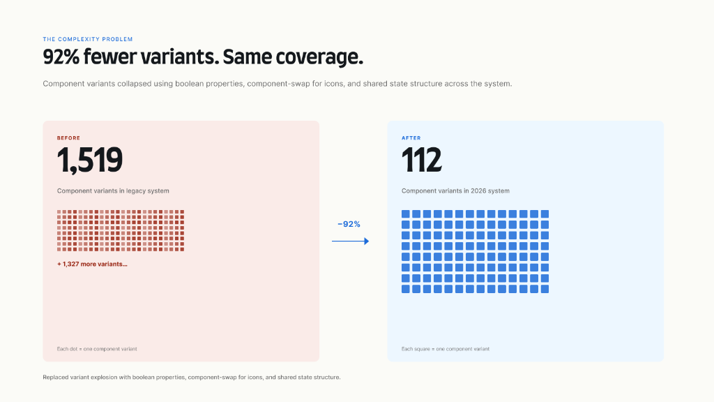
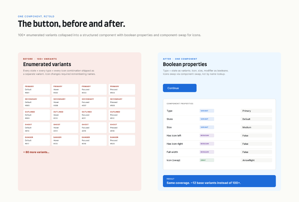
The button component alone had over 100 variants — combinations of primary/secondary/outlined × normal/focused/hover/pressed × with-icon/without-icon, with no shared structure. Across the full system, we'd accumulated 1,519 component variants. Changing an icon inside a button required remembering the icon name and selecting a different variant entirely — there was no component-swap property. Frame loading on complex screens took 40–50 seconds.
02—A flat color palette masquerading as a token system
Colors existed as a primitive palette only — IDP-Blue-400, IDP-Blue-500, and so on — with no semantic layer telling designers where each color should be used. There were no surface tokens, no text tokens, no border tokens. Each designer made their own interpretation. Light and dark themes didn't exist.
03—WCAG failures across the palette
Because the primitives were defined for brand fidelity rather than accessibility, several color combinations the system implicitly allowed didn't pass contrast checks. Designers and engineers were unintentionally shipping inaccessible UI.
04—A growing gap between design and engineering
The Figma design system and the engineering CSS library used different naming conventions for everything — including colors. Design sign-off became a debugging session. The engineering team had effectively stopped relying on the Figma system as a source of truth and was maintaining their own parallel reference.
05—Cross-geography divergence
Without a strong semantic layer, regional teams improvised. The Partner Portal team in Chennai used numerical tokens (IDP-Blue-400, 500, 600). The Student Portal team used named tokens (IDP-Blue-Light, Dark, Darkest). Neither approach told a designer where to use which color. As a result, the same brand color appeared in completely different contexts across products, and the IDP visual identity fragmented.
Why this was hard
A design system rebuild for a single product team is a known problem. This was harder for four reasons.
1. Cross-geography buy-in
12 designers in four cities, each with their own working habits and (in some cases) their own ad-hoc component libraries built to work around the shared system. A new system without their buy-in would simply become a sixth ad-hoc library in the org.
2. Cross-domain governance
The Partner Portal and Student Portal serve fundamentally different audiences (B2B partners vs. B2C students). The Student Portal team initially argued for visual differentiation through color — a reasonable instinct, but one that, in practice, had produced fragmentation rather than differentiation. The case for a unified system had to be made on technical and accessibility grounds, not just visual ones.
3. No mandate to break things
Leadership approved the rebuild but didn't authorize a hard cutover. Existing products were mid-sprint, integrated with each other, and couldn't absorb a forced migration. The new system had to coexist with the old one and earn adoption product by product.
4. An AI-readiness target with no internal precedent
No one had built a design system at IDP that was AI-tool-compatible, MCP-connected, or designed to stay in sync with code repositories. I researched how Atlassian, IBM, and Microsoft structured theirs and worked out my own architecture from that base.
The approach
I structured the work in four sequential layers, starting from extensive research up to AI integration pipelines.
Layer 1 — Research & Alignment
Ten months before building, I spent time understanding three things: how each regional team was actually using (or working around) the existing system; what the engineering team needed for the design-to-code sync to function; and how mature design systems at IBM, Atlassian, and Microsoft structured primitive and semantic tokens. Figma's advancements in variables and modes during 2024 became the technical foundation.
Layer 2 — Token Architecture
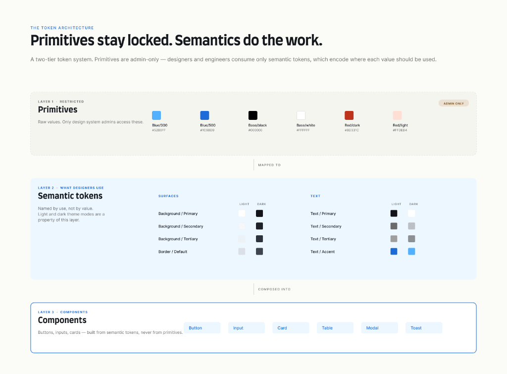
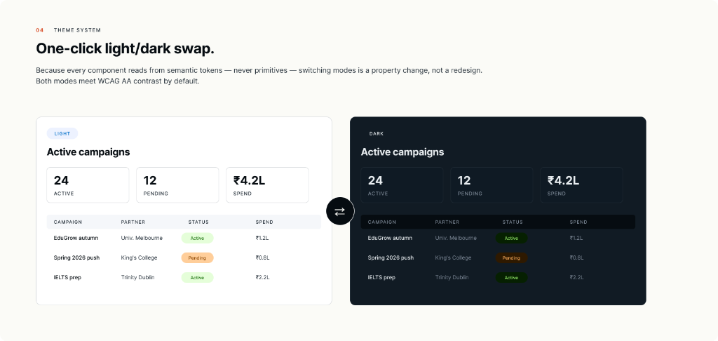
I built a two-tier token taxonomy. Primitives — raw color values, raw spacing values, raw type sizes — are only accessible to design system admins and managers. Semantics — Surface/Default, Surface/Subtle, Text/Primary, Border/Strong, Action/Primary — are what every designer and engineer actually uses.
The reason this matters: when primitives are exposed to consumers, people pick colors by what looks right. When semantics are exposed, people pick colors by what they mean — and meaning enforces consistency. Light and dark themes became one-click swaps because the semantic layer already encoded where each color belonged. Accessibility became the default rather than the exception.
Layer 3 — Components
I rebuilt the base components — buttons, inputs, icons, spacing primitives — from scratch using Figma's current best practices: boolean properties, component-swap for icons, variant structures that collapse combinatorial explosion into composable properties. The button went from 100+ variants to a structured set with boolean toggles for icon, state, and size. Total system variant count dropped from 1,519 to 112.
Regional design teams now build their own product-specific components on top of this base. I review every contribution to keep naming and structure aligned with engineering conventions.
Layer 4 — AI & Code Integration
This is the layer that made the system genuinely different from what existed before. Working with engineering, I established an MCP (Model Context Protocol) connection between the Figma file and the code repository. When tokens or components update in Figma, the AI tooling detects the change and surfaces it to the relevant engineering team. I used Claude AI to accelerate generating Angular component scaffolding from the Figma source; engineering reviewed and refined the generated code, and now owns it as a shipped component library.
The result: a designer updates a semantic token, and that change can propagate to the code repository through a chain that humans review but no longer have to manually translate. Production-ready code from AI tools now respects the IDP design system as a constraint, because the system is structured to be machine-readable.
Model Context Protocol Sync Schematic
Figma Variables
Design tokens & component schemas in Figma
MCP Bridge
Detects variables updates and parses token JSON
Angular Library
Tokens compiled into SCSS variables & components in Git
The hardest decision
The hardest call wasn't technical. It was the migration strategy.
Option A was a hard cutover — deprecate the old system on a fixed date, require every team to migrate within a quarter. Fast, clean, painful, and likely to fail given mid-sprint integrations and the cross-product dependencies.
Option B was indefinite backward compatibility — let teams adopt at their own pace. Safe, low-friction, and likely to result in a half-migrated system that never reached consolidation.
I chose a third path: gradual migration, sequenced by product readiness, with a six-month soft deadline. When a product team had upcoming sprint bandwidth, we used that window to migrate them. Sequencing was decided by integration complexity — tightly coupled products were migrated together; standalone products went first to build confidence. Within six months, almost all products were on the new system.
What I gave up: speed, and the cleanliness of a single cutover date. What I gained: actual adoption. The old system isn't dead today, but it's no longer the source of truth for any active product.
A separate trade-off worth naming: the color palette itself. IDP has a dedicated branding team that owns brand color decisions. I raised UX concerns about visual homogeneity across some contexts, but the branding decision wasn't mine to make. I worked within the palette I was given, and where I could push, I added UI action colors that the brand team hadn't originally specified — by demonstrating the UX cost of not having them. Design systems are partly a negotiation; this one was.
What changed
Adoption
The new system is now used by all 12 designers across Chennai, London, Melbourne, and Taipei, and by 50+ engineers globally consuming the system through the MCP-connected code pipeline.
Complexity Reduction
Component variants reduced from 1,519 to 112 — a 92% reduction. The button alone went from 100+ variants to a structured boolean-driven set. Icon swapping moved from name-based variant lookup to true component-swap property.
Performance Boost
Complex frames (data tables, dense dashboards) that previously took 40–50 seconds to load now load in under 10 seconds. This is the observed difference on the screens our team builds most often.
Engineering Velocity
The engineering manager I work most closely with estimated, based on her team's workload tracking, a 30–40% reduction in implementation time — driven by the design-to-code naming alignment and the MCP-propagated component sync.
Design Velocity with AI
Designers using Figma Make and Google Stitch with the new design system as a constraint now generate production-ready output rather than ideation-only output. The team's qualitative estimate is that the design-to-handoff process is 30–50% faster for screens that fit the existing component set.
Accessibility Conformance
Semantic tokens are designed to meet WCAG AA contrast standards by default; a subset meet AAA. Designers and AI tools consuming the system now produce accessible-by-default output instead of accessible-by-accident output.
Visual Consistency
Visual divergence between Partner Portal and Student Portal — previously a recurring complaint — is no longer a recurring complaint. Designers don't detach components in working files because the slots and variant structure now accommodate the variations they used to detach for.
Component Variants
Figma Frame Load Time
Engineering Dev Time
What I'd do differently
Two things stand out in hindsight.
I'd build in Storybook in parallel with the Figma work, using Code Connect from day one. I built the Figma side first and the code side later. That sequence worked, but it added a translation layer that didn't need to exist. If Storybook and Code Connect were live from the first component, design-to-code parity would have been a property of the system, not a goal to retrofit.
I'd build sub-brand-aware components from the start. The current system serves the unified IDP brand cleanly, but as IDP evolves toward more sub-brand-differentiated products, I'm now retrofitting variation into components that were designed for uniformity.
I'd also document the architecture research more formally. I read deeply into IBM Carbon, Atlassian, and Microsoft Fluent, but I didn't write down my synthesis. When new team members ask why we structured tokens the way we did, the answer lives in my head. That's a single point of failure I'd remove.
What's next
The current system serves IDP's non-IELTS products with a single brand. My longer-term vision is a unified IDP design system that includes both the in-house products and IELTS — with sub-brand modes that let a single component library produce IDP-branded and IELTS-branded surfaces with a single appearance swap, the same way light and dark themes work today.
That requires alignment beyond the design team — IELTS has different governance — but the technical foundation is now in place to support it.