Netrocon Digital
Redesigning a multi-vertical digital agency platform to let four distinct service branches speak to different audiences under a single, cohesive visual system.
Four agencies, one roof
Netrocon Digital is not a standard single-service agency. Instead, it operates as four distinct micro-agencies bundled under one umbrella:
- Marketing: Direct response performance marketing, PPC, SEO, and content.
- Branding: Identity design, brand strategy, and storytelling.
- Studio (ND Studios): In-house eCommerce product photography and visual assets.
- Tech Hiring: Global tech staffing and offshore recruitment solutions.
Each vertical targets a completely different buyer. A nonprofit director looking for marketing has different needs than a DTC founder looking for photography or a CTO needing offshore developers. The challenge was to design a single platform that establishes authority for all four departments without reading as disconnected microsites or diluting Netrocon's core brand.
Positioning wedge
"Movement, Cultural, and Social Purpose Marketing"
Boutique businesses, startups, and non-profits cannot compete with enterprise ad budgets. My positioning strategy centered Netrocon as the champion of these purpose-led brands. Instead of outspending, Netrocon helps them out-storytell. By aligning campaigns with values their audiences already believe in, they build organic reach and loyalty.
This audience positioning was key. The site explicitly targets small-to-medium businesses and non-profits, but borrows high-level trust signals (grayscale logos, pricing transparency, and guarantees) to establish immediate enterprise-grade credibility.
Repeatable flow structure
To keep the development scope lean and the user experience predictable, we established a single, highly repeatable page template structure across all four service verticals:
High contrast editorial feel
Colors & Typography
The visual styling relies on Helvetica and Arial system stack layouts, emphasizing large, heavy headlines. The color tokens are stripped back to absolute core values:
Signature UI highlighter
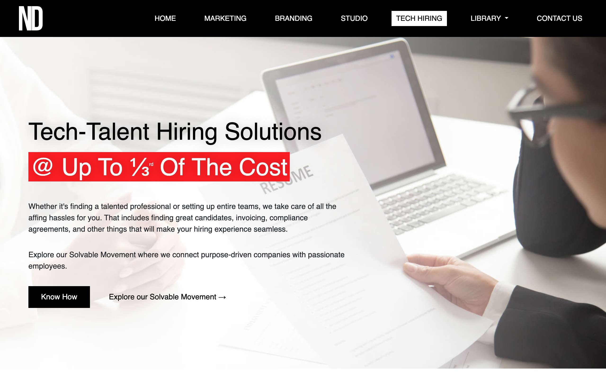
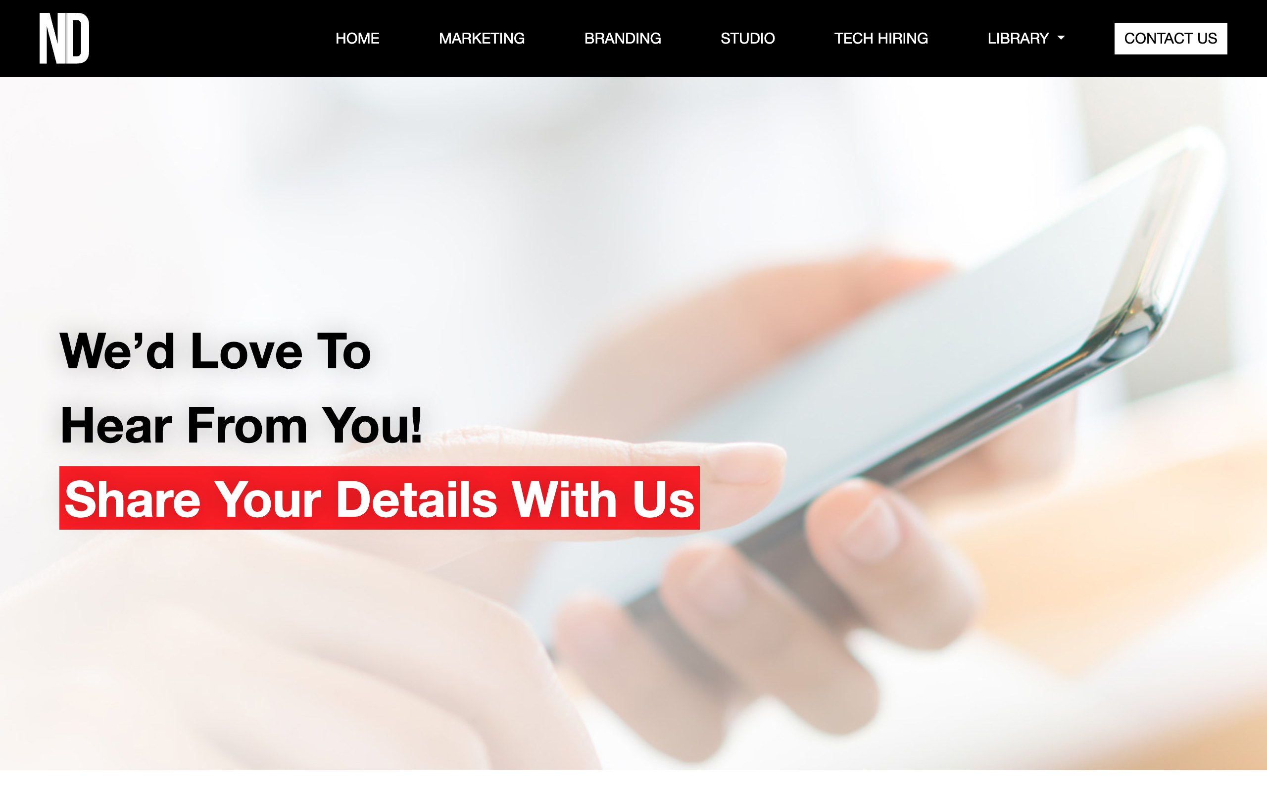
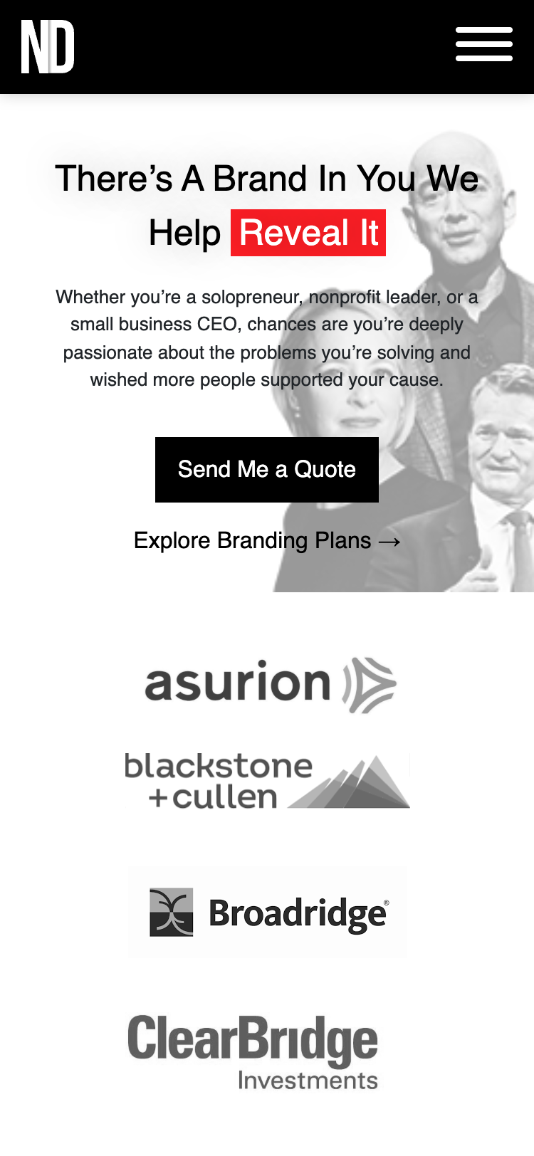
On every single page, a key phrase in the main headline sits inside a solid red rectangle with white text. This simulates a high-impact highlighter pen. This visual device instantly ties the four different agency divisions into a single brand:
Helping Noble-Minded Brands Survive & Thrive
Alternating rhythms & color pop
Long scroll layouts alternate between dark and light full-bleed sections, divided by a thin red divider strip to pace reading. Photography remains completely desaturated, letting the solid red highlighter block provide the sole color accent on the screen.
Trust bars & tiered pricing
A grayscale trust logo grid (reusing logos from clear credibility partners like Asurion, Blackstone, and Broadridge) anchors the top of page views. Tiered SaaS-style pricing matrices on marketing, branding, and studios qualify leads directly on the page, bypassing lengthy sales cycles.
The core screens
Homepage
The entryway establishes the core value statement: "Helping Noble-Minded Brands Survive & Thrive". Below the fold, a clean 4-card grid introduces each of the micro-agencies, leading into value testimonials and the different section CTA.
Marketing Vertical
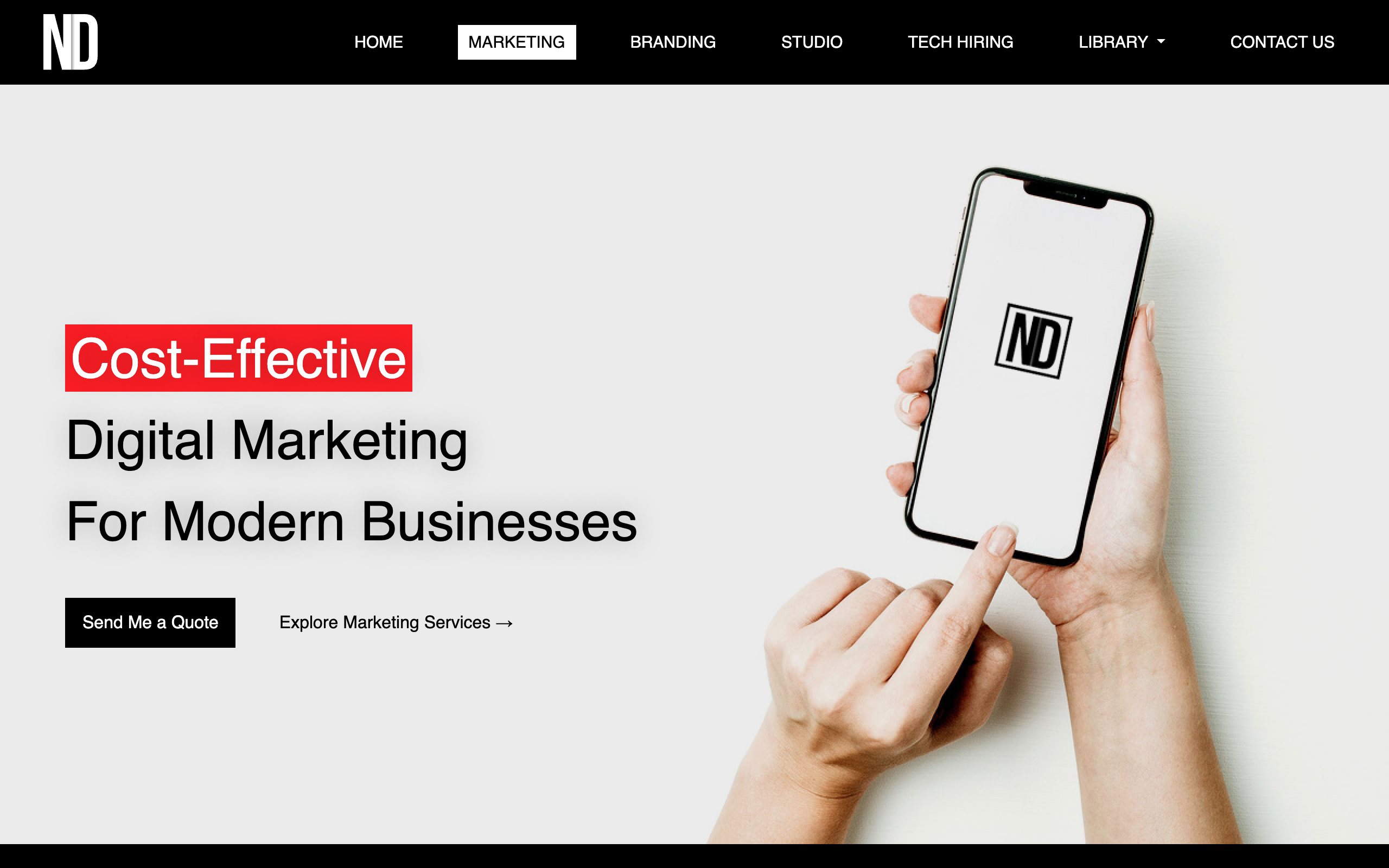
Focuses on cost-effective digital marketing for Education, Healthcare, eCommerce, and Non-Profits. Details PPC, Content, and SEO plans alongside the core purpose-marketing strategy and a 3-tier pricing comparison table.
Branding Vertical
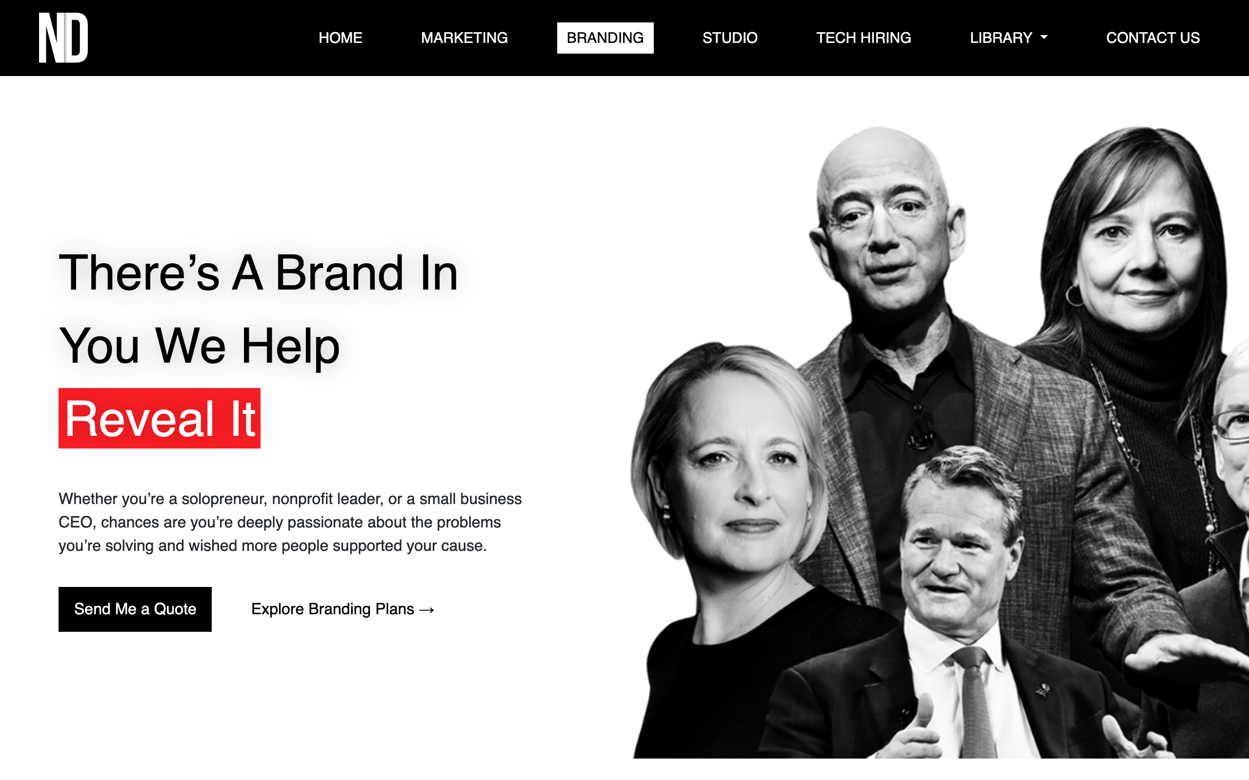
Anchored on the statistics-driven value prop: 89% of shoppers stay loyal to values-aligned brands. It documents stand-out strategies, visual identity packages, and displays a transparent 4-tier pricing model.
ND Studios
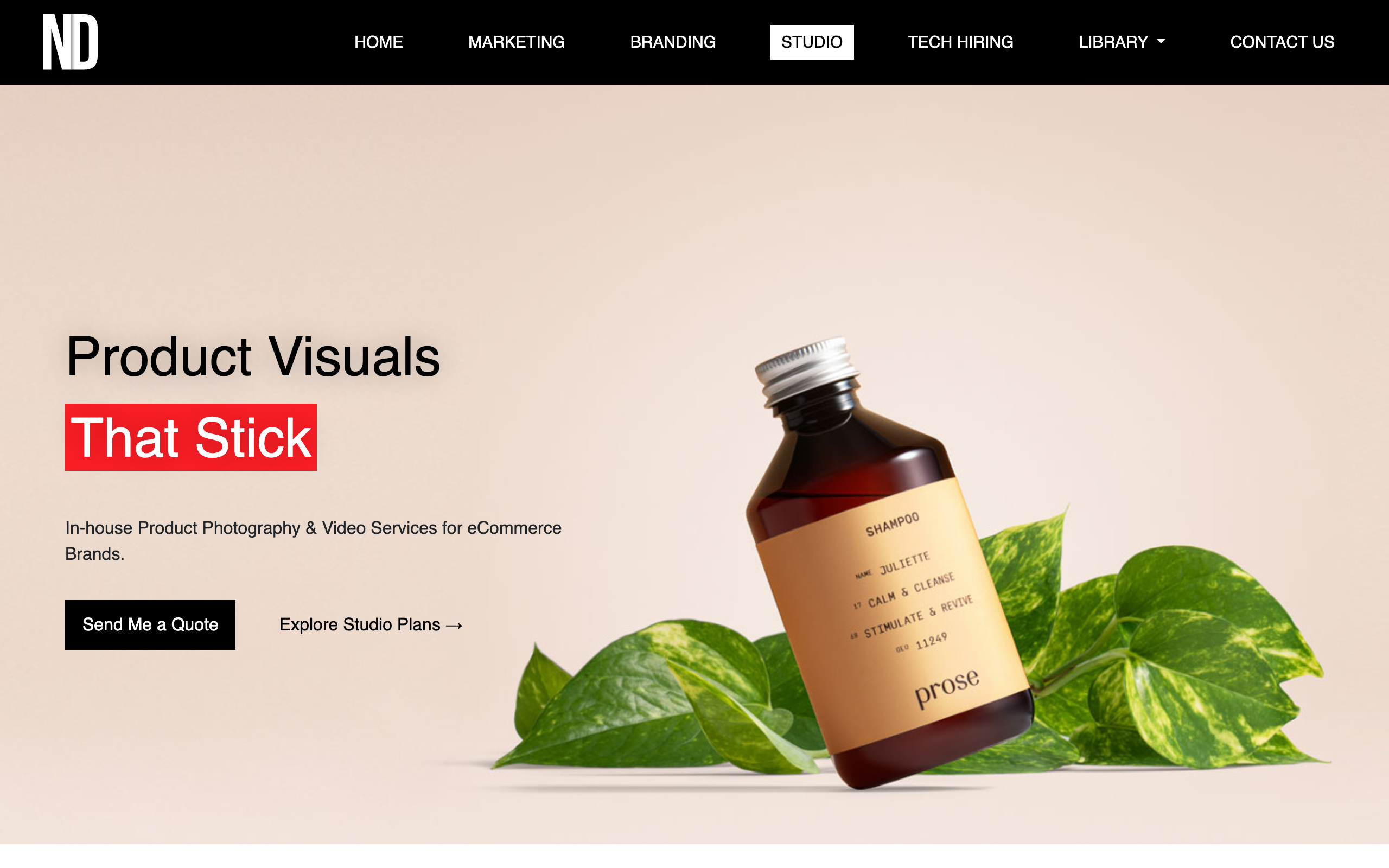
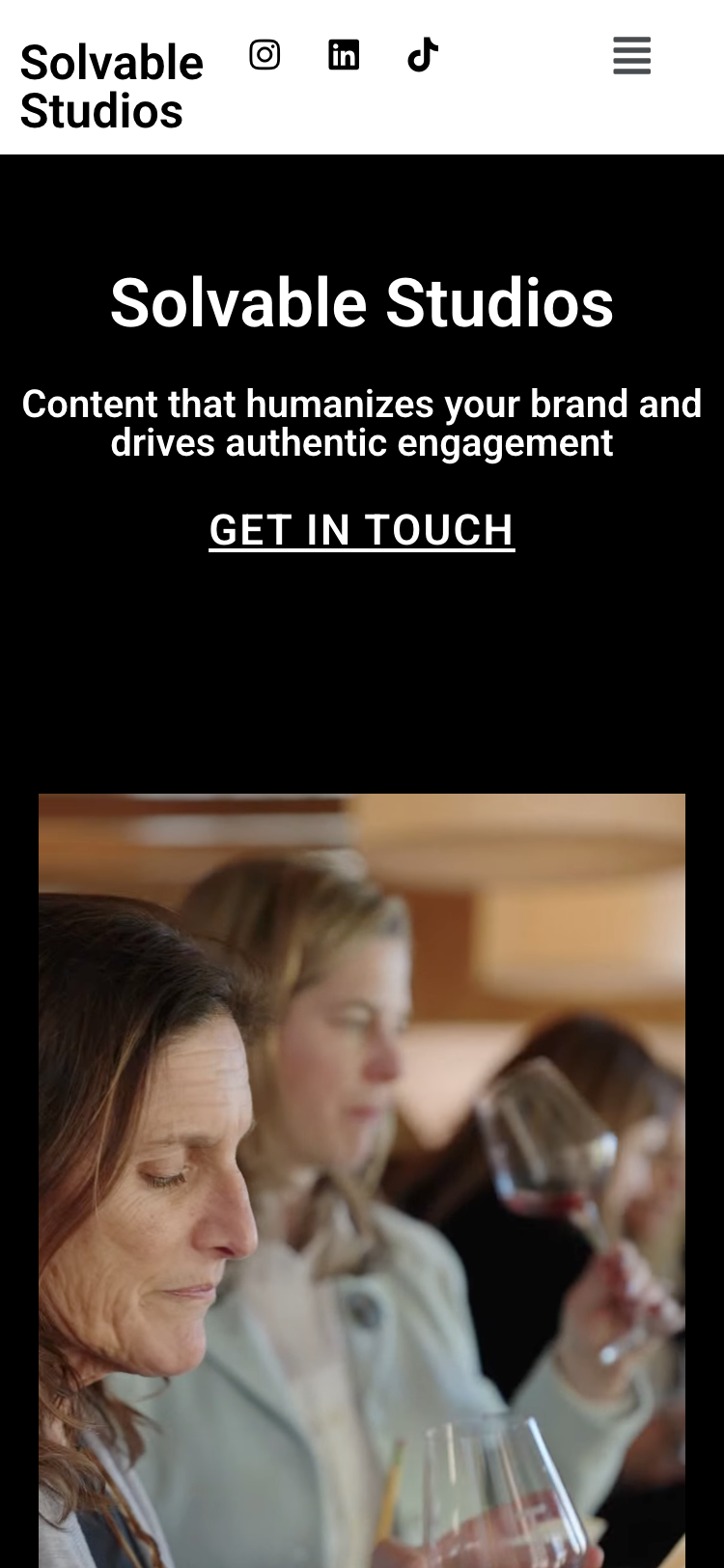
Presents high-fidelity product imagery packages. Highlights benefits like reducing return rates and boosting sales, offering structured photography bundles (Amazon Bundle, Bulk On White, A La Carte).
Tech Hiring Solutions
Outlines offshore developer recruiting. Promotes up to one-third US developer cost savings, high retention metrics, a zero-risk 2-week guarantee, and a simple 3-step placement workflow.
Contact & Routing
Includes a custom dropdown selector to route incoming business requests directly to the correct department (Marketing, Branding, Studio, or staffing). Lists coordinates for their three offices and publishes an anti-fraud security notice.
Responsive adaptation
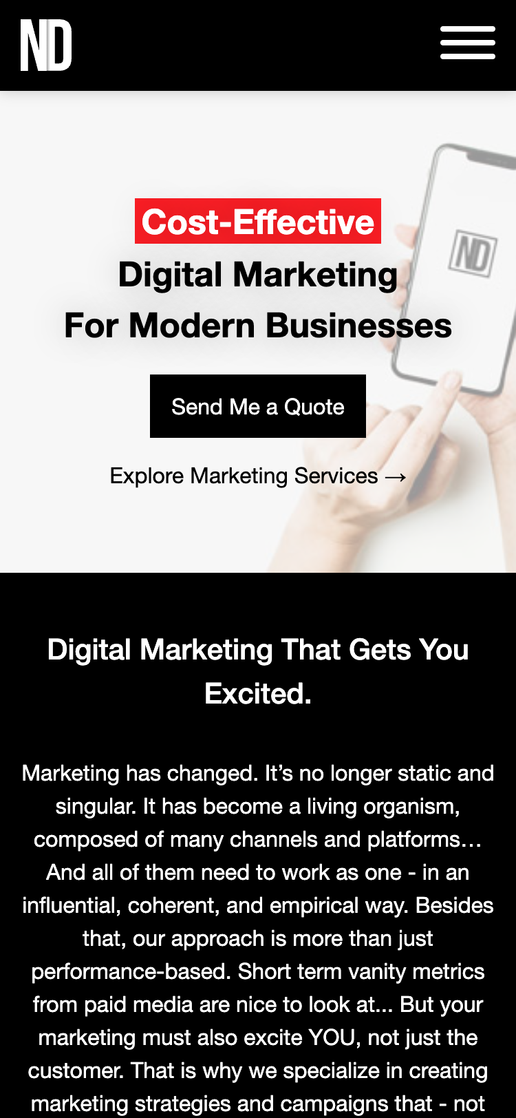
To accommodate mobile visitors, the large, bold headlines stack vertically on small screens, shifting from horizontal layouts into vertical streams above desaturated image backgrounds.
The desktop navigation bar collapses into a touch-target hamburger menu that slides out to present navigation links. Pricing tables adapt into swipeable cards so users can compare packages.
Designer notes
Structuring four distinct verticals under a single domain demanded a strict template layout. Designing the verticals around a single repeatable grid template ensured we could build, ship, and test the entire site in a tight two-week window.
The red highlighter visual motif proved to be the magic component that unified the pages. It bound visual photography portfolios, complex staffing forms, and SaaS pricing grids into a single, cohesive brand voice.